
Ten years ago, Flowhub was born out of a dream to make safe cannabis products accessible to every adult on planet Earth. We started as a scrappy team helping retailers navigate a world that didn’t always want them to succeed.
If you’ve been with us for a while, you know the heart of this company hasn't changed. But as anyone in this industry knows, if you aren't evolving, you’re getting left behind.
That’s why I am incredibly proud to reveal Flowhub’s new brand identity as a reflection of who we are, where we are going, and what we represent.
Before showing what’s new, I’d like to share the reasons why it was time for a fresh look.
Why change?
We’ve always loved our brand. Still do.
But as we scale into our second decade, it became clear that our previous identity was becoming a tax on our growth—and by extension, yours.
We decided to rebrand Flowhub for three core reasons:
1. Differentiation
Walk any cannabis trade show floor and you’ll see it: leaf after leaf after leaf.
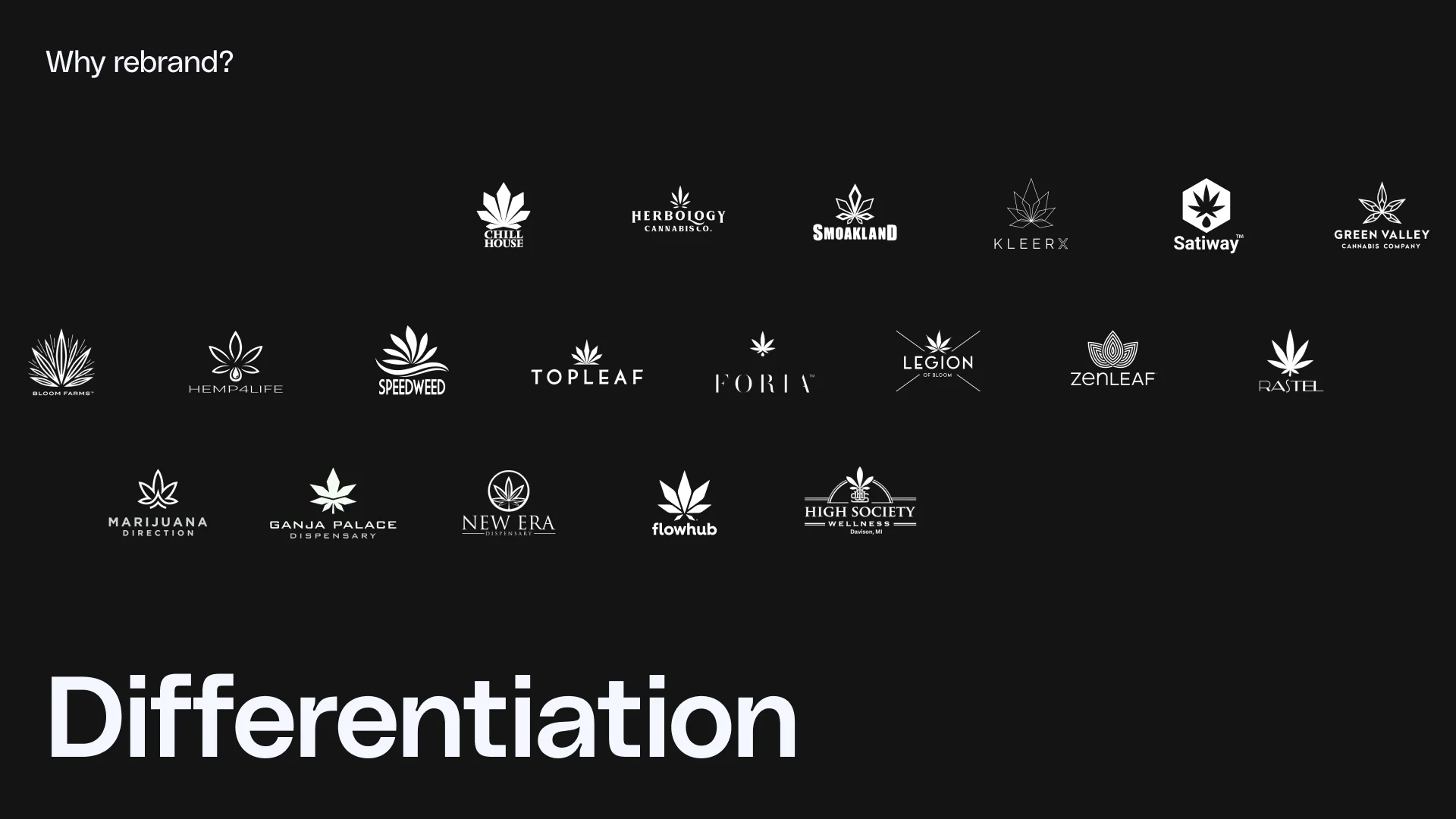
We wanted to stand out, but we were blending in.
Fun Flowhub fact: Back in 2015, when Kyle Sherman was first launching Flowhub, getting a federal trademark for anything cannabis-related was nearly impossible. Our original logo—the one many of you have worn on t-shirts for years—was actually federally trademarked by claiming it was a Japanese maple leaf.
While that "maple leaf" served us through our infancy, visually we looked like everyone else. We needed an image that is unmistakably Flowhub.
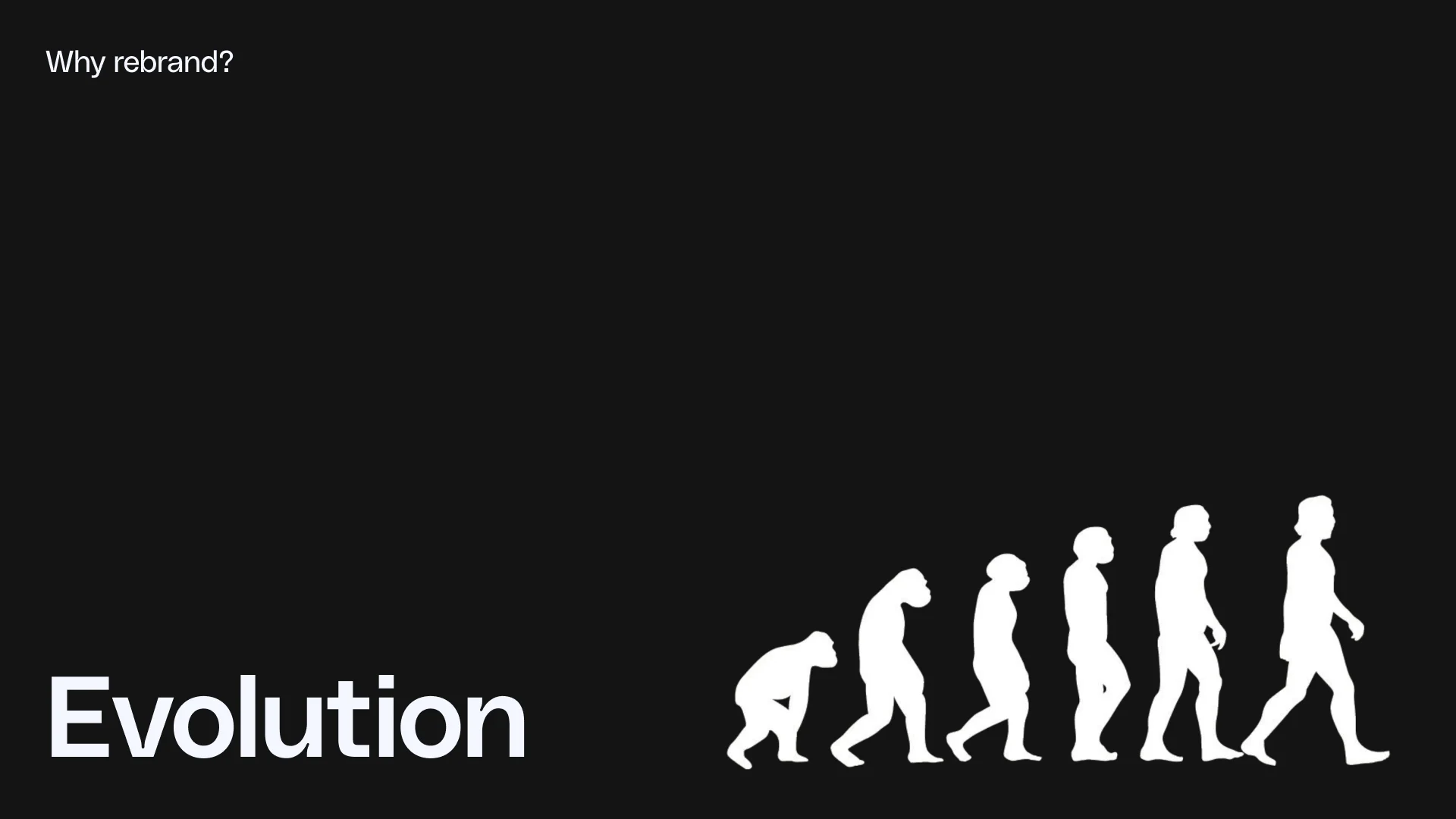
2. Evolution
The cannabis industry is maturing, and we’re growing up with it.
Our customers are running sophisticated, multi-location operations, managing complex inventory, moving real money, innovating on the consumer experience, and bringing quality plant medicine products to people who need them. This is seriously regulated retail, and it deserves infrastructure that looks the part.
The stigma that once defined this industry is fading, and our old image was keeping us anchored to it.
We’ve been debanked. We’ve been denied services and kicked off platforms. Some companies in traditional industries still won’t work with us or feel comfortable associating with us just because we’re in cannabis.
We want Flowhub to be a shortcut to freedom for you. When a retailer looks at us, they should see a technology partner that is fluid, trustworthy, and unstoppable despite the red tape.
3. Expansion
This rebrand isn’t just about who we are today, it lays the foundation for where we’re going.
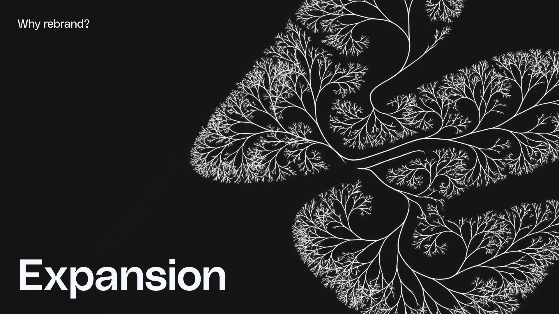
While cannabis is our foundation and our absolute focus, the problems we’re solving—simplifying rigid compliance regulations, complex data architecture, and unique operational workflows—are bigger than any one category.
Flowhub is a technology company built for highly regulated retail.
A brand built on flow
Every strong brand starts with a core idea. Ours is flow.
Water was our inspiration as the clearest expression of that idea. We’ve actually always been drawn to water. You see it in our brand already with the poolside Maui vibes... Bong Water anyone?
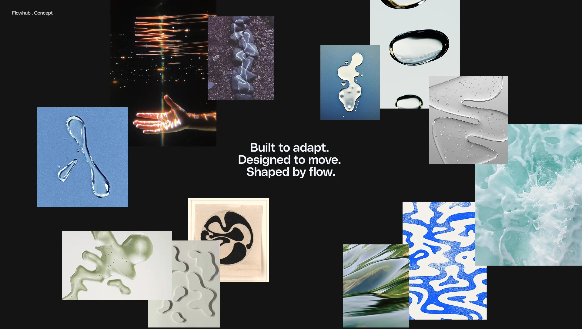
Water flows around obstacles, always finding the path of least resistance. It connects systems. It nourishes everything it touches. It's fluid enough to adapt and strong enough to shape its environment.
Water is the foundation of life. It’s the natural element that’s required for growth.
Flowing like water isn't just what we do, it’s how we move.
With that in mind, we conceptualized the new Flowhub brand identity.
What does Flowhub’s new logo mean?
At its core, our new logo is an abstract expression of the letter ‘F’.
I think you can look at this for a long time and see a lot of things (depending on what’s in your system). Internally we’ve been calling it the "river.” I also see a symbol of fertility, perhaps a nod to Venus of Willendorf. I'd be curious what other things you see in this logo.
Rita, our talented lead brand designer, created this mark from a place of true artistry. The first version wasn’t designed in software, it was painted with watercolors. She experimented with brushstrokes and movement on paper, letting the shape emerge naturally before translating it into the design system you see today.
Flowhub’s logo represents entering the "flow state," that mental state where you're fully immersed and everything just works. Its organic, fluid curves reflect how Flowhub works behind the scenes—powering systems, navigating complexity, and helping businesses grow without friction.
It flows as freely as the businesses we serve.
What to expect next
You’ll start seeing this updated brand across our website and marketing materials now, with gradual changes inside the product to follow.
We’re rolling this out thoughtfully. Not all at once, and not in a way that disrupts your day-to-day operations, especially around critical moments like 4/20.
So if you see a mix of old and new for a bit, that’s intentional.
Our roots are in the soil
While our look is evolving, what won’t change is more important:
- Our unwavering commitment to the cannabis industry.
- Our focus on helping you scale and stay compliant.
- Our belief that you should own your business and your data.
We are a tech company forged in the fire of cannabis regulation. We solve the hardest problems in retail for the most complex industry on Earth. Our new brand gives us the room to grow, but our foundation remains exactly where it has been for the last decade: right here with you.
We hope you love our new brand as much as we do. We’re proud of what we’ve built together, and we’re just getting started.
Now go with the flow.
Be water, my friend. Empty your mind. Be formless, shapeless—like water. You put water into a cup, it becomes the cup. You put water into a bottle, it becomes the bottle. You put it in a teapot, it becomes the teapot. Water can flow, or it can crash. Be water, my friend.
Bruce Lee


